History
Jacques Martinez
Peintures récentes
January 28 – February 22, 1975
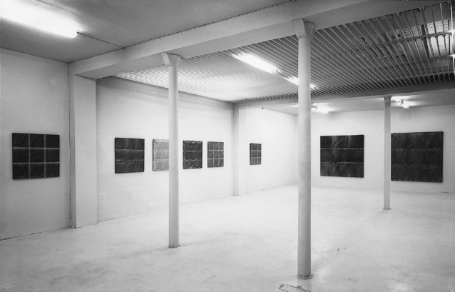
Never before have we seen so many folds in the galleries as we have these days. Folds in large, stretcher-free canvases, the persistent marks of successive manipulations of the fabric – folding, folding, unfolding, so that the ink soaks into the calico layers, following a line that owes nothing to ruler and pencil – by Support-Surface alumni, those of Group 70 and their satellites. Raised folds imprison color, but also false folds on stretched canvas: see Jacques Martinez, exhibiting at Templon. Martinez works in small format, stretching his canvas on a frame. He posits the plane as the basis of all pictorial reality, and the fold as the defining element of a materialist space in which color is inscribed. Since there is a plane and a fold, the fold only wants to be false. An old story, in short. As the artist points out, there are plenty of folds in the Louvre; there are those in tablecloths fresh from the cupboard, in the paintings of still-life painters, competing in technical prowess to deceive their world; in the work of the Flemish, as in Rohner’s (he is currently exhibiting at Place François-1er), to keep with a certain Parisian topicality.
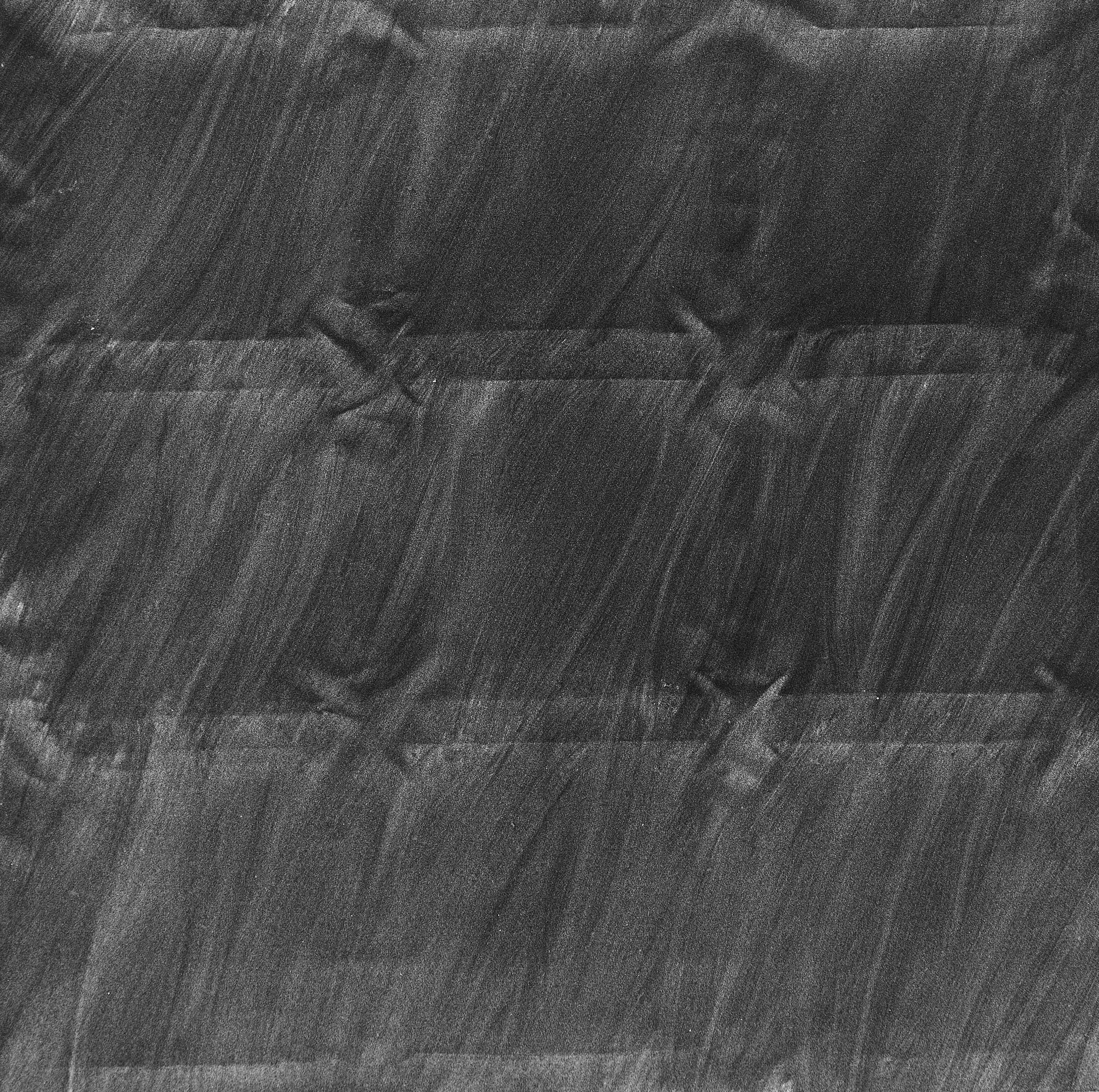
Martinez’s canvases are curious, pale, cool, crumpled, quilted and silent. Invariably square in format, each reveals a grid dividing the space into nine equal squares. On this rigorous geometric structure, color is applied once, in gradations, from blue to yellow-green, or from blue to red, for example, then a second time, transparent and covering, applied with a large brush, which reunifies the space and maintains the hues in pinks, brown-greys, beiges and greens. This is where its surface application reveals the effects of upholstered fabrics, folds or crumpled paper.
Geneviève Breerette, Le Monde, 18 janvier 1975
Louis Cane
May 16 – June 7, 1975
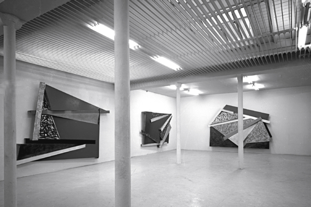
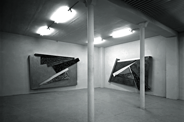
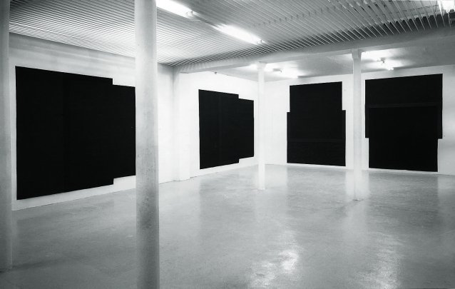
The series of dark paintings exhibited today by Louis Cane is the formal consequence of a body of work that has been developing since 1967, on stretcherless canvases presented stretched on the wall or floor. The question of the presence or absence of a stretcher is not to be considered here in terms of novelty or originality, but rather in relation to the staging and the analytical – or, if you prefer, critical – gesture proposed by the artist. In the formal organization of this series, Louis Cane’s aim is to synthetically highlight the determinations and consequences of the working process of the material he uses. These canvases are particularly didactic. What about the action of cutting the canvas to create a cut-out painting? It seems to me that not enough attention has been paid in the analysis of collages or paper cut-outs, say by Matisse, to the relief created on the support by the thickness of the paper, a relief that in Matisse’s case is countered by a number of pencil strokes (mostly absent from reproductions). It is this relief, the relief of the thickness of the cut canvas, that the present series deals with. I liken this relief to the edge of a painting exhibited on a frame. A number of modern artists have already addressed the question of the edge of the unframed painting. This question is played out here as a critique of the unity of surface in consideration of the thickness of the material that creates this surface. The darker strip of canvas cut from the rectangle and folded thickly over the other part of the canvas accentuates the painting’s out-of-frame aspect. In this way, it establishes the link between formal determination and the process of constituting (cutting out) forms in the double square it stages (the smaller square it limits and the larger one in which it inscribes itself as a kind of giant capital C*). This strip, which can’t help but evoke an open frame, transfers to the painting the reverse side and thickness of the canvas support on which it was cut; a canvas which, by this very fact, finds itself (in its thickness) cut out of the wall. I’d say that here, the object is reduced to the explicitness of its conceptual realization and its consequences. One of its consequences is to call itself into question as an object, to accept as a representative support only the thinness of its material.
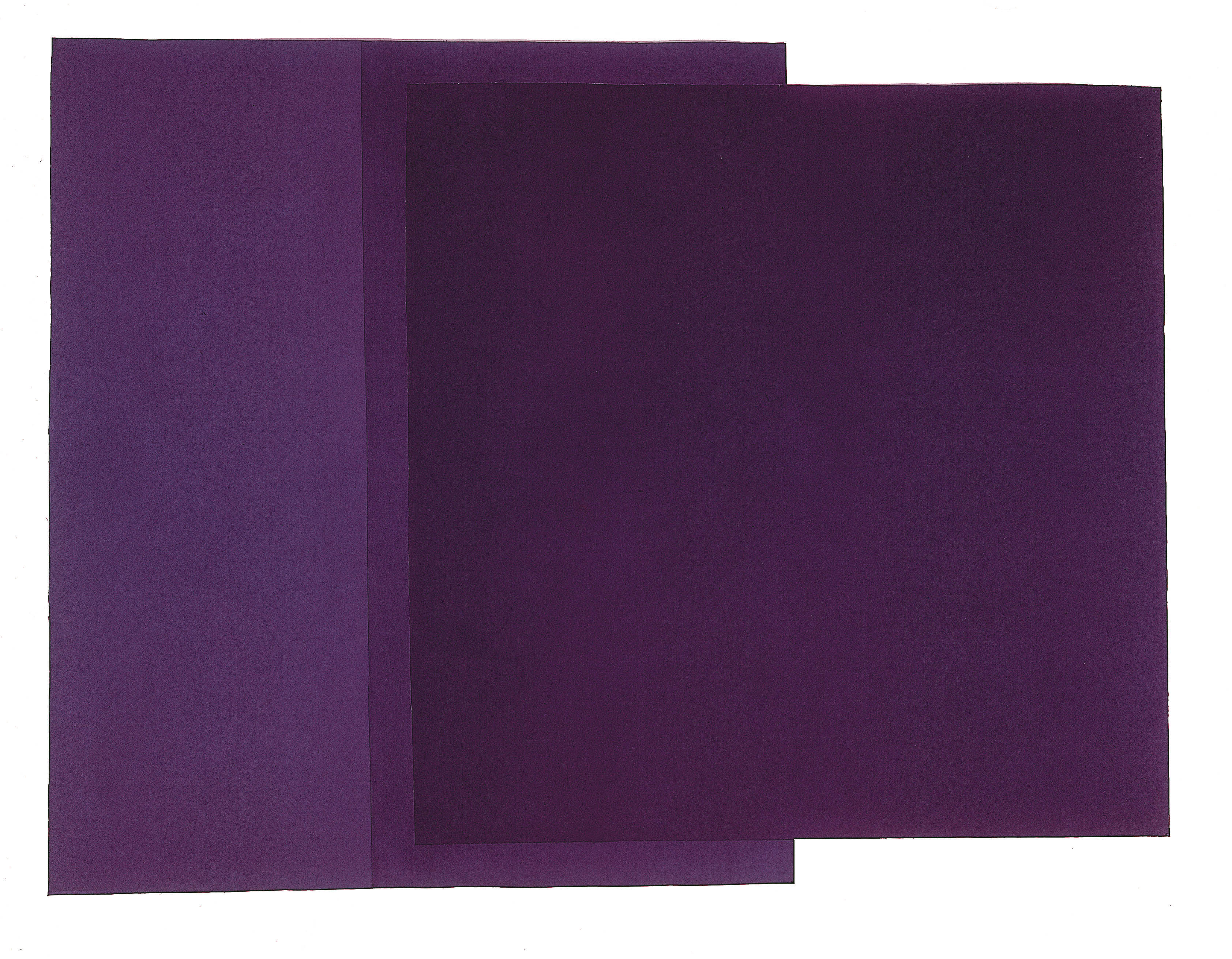
The conflict between the real space: the wall, and the interpretative (analytical) proposition: the painting, takes charge of the inscription of one on the other and produces that irreducible paradox: the colors. “Cutting into the canvas brings out the thin relief (the relief of the canvas) that qualifies the colors, and we are carried away into their dark depths, their bottomless depths…
Marcelin Pleynet, Exhibition text, Leo Castelli Gallery, New York, March 1977
Donald Judd
June 12 – July 12, 1975
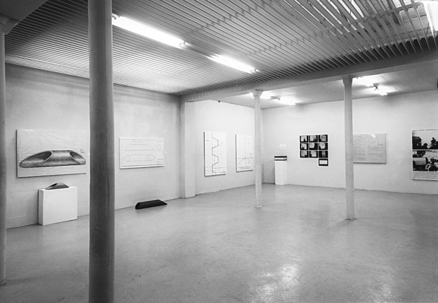
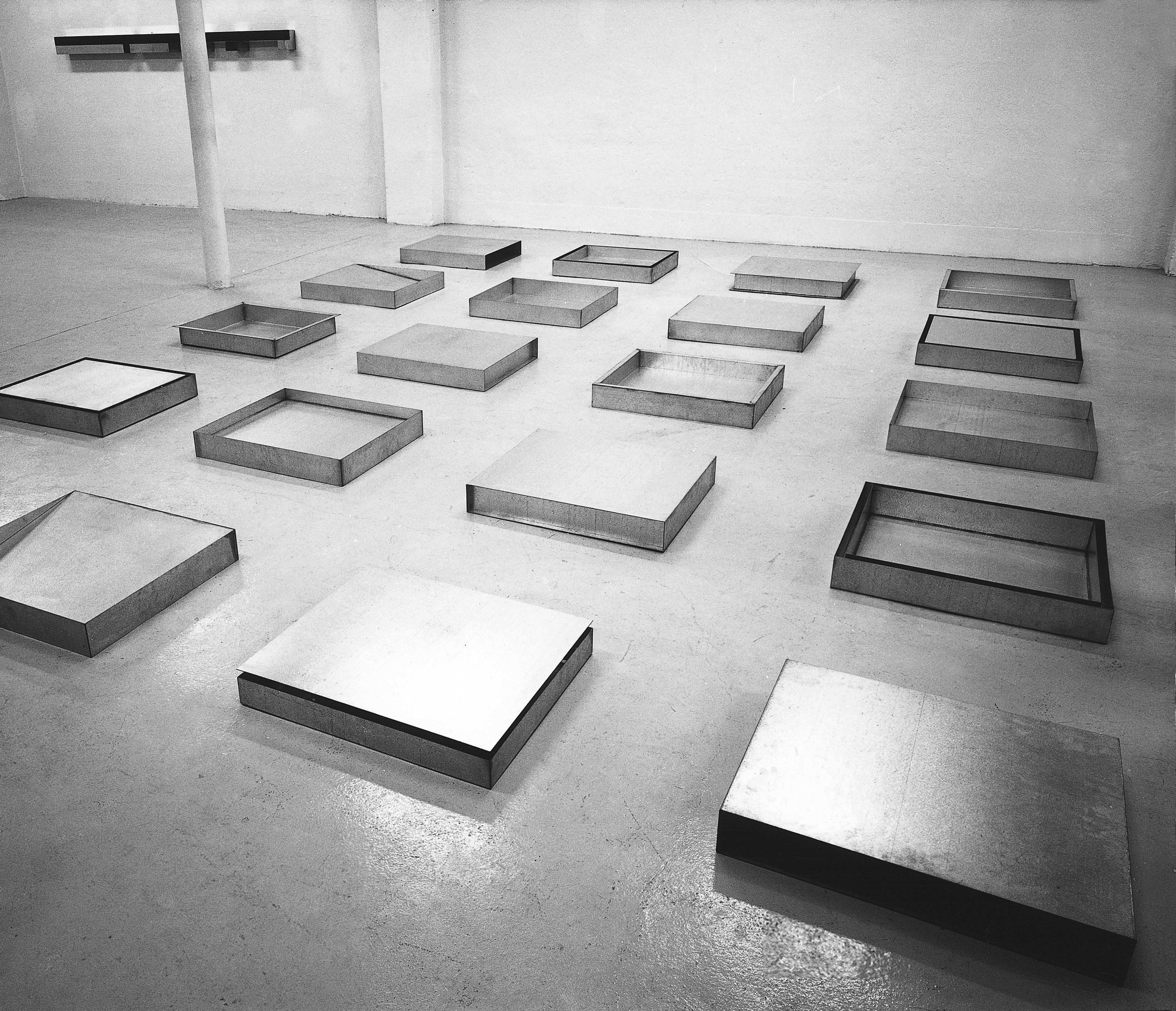
Minimal sculpture cannot be defined as either an object or a monument. Common features of Judd’s and LeWitt’s work are particularly explicit in this respect. In both works, the same volume (the parallelepiped in Judd’s case, the cube in LeWitt’s) is constantly used on a human scale, […] far smaller than the dimensions of a painting by Newman or Rothko. Moreover, the systematic repetition of this volume, exhibited alone or in series, its sides full or empty, made of opaque or transparent materials, fixed to the wall or placed on the floor, proves that the interest of the work lies not in a form or object considered in isolation, but in the process of transforming this form and in the resulting didactic demonstration. […]The anecdotal content or aesthetic effect of a traditional work of art, based on an inherently idealistic existence, obscures the way in which it was conceived, the way in which it is perceived, in other words, the way in which it relates to and differs from reality. In Minimal Art, on the other hand, the emphasis is on the relationship between the work and what produces and surrounds it: the space, the framing – the support for the work – the picture rail, the floor – and, by induction, the observer, as well as on the relationships between the various elements that make up the piece. Judd’s transparent boxes […] make it possible to see all sides of the volume at once, and to distort them optically; the wall sculptures of Judd and Judd involve the wall space in the work’s functioning. […] The emergence of this infinity of internal and external relationships is accompanied, for the observer, by contradictory perceptual phenomena and aberrations. The function of the logic of geometric laws is to make these phenomena all the more evident – and disturbing – by measuring them.
Catherine Millet, art press, February 1973
The American minimalist Don Judd is the author of my favorite aphorism: “If someone says it’s art, it’s art”. What I like about this phrase is that if we accept it, we must also accept its opposite proposition: “If someone says it’s not art, it’s not art”. That’s how you end up where you started.
Michael Gibson, International Herald Tribune, 28 juin 1975
Bernar Venet
September 16 – 20, 1975
Bernar Venet, le peintre sans pinceau
“I stopped painting the day I realized that an artist didn’t have anything new to say all his life,” explains Bernar Venet, who gave up brushes and colors for good in 1970, at the age of 30. This does not mean that Venet has changed his profession; he simply practises it in a different way. […] At the Galerie Daniel Templon, he is currently exhibiting a summary of an approach that has taken him from the black monochromes of 1961, painted with tar, to the enlargement of mathematical diagrams. Henceforth, Bernar Venet’s work is verbal, as his ambition is to reduce the gap between the mode of communication of science and that of art. Initially, the enlargement of a mathematical diagram can be likened to the enlargement of a comic strip, and Bernar Venet is quick to be classified as a descendant of Pop Art: “By inflating a Coca-Cola bottle excessively,” he says, “you transform it into an ambiguous object. My enlargements alter neither the meaning nor the information.” A long stay in New York and constant contact with conceptual artists confirmed Bernar Venet in his position. For him, the interest of art lies neither in plastic effect nor style, but solely in its contribution to the knowledge of art.
All Bernar Venet’s work is thus limited to references or codes, offering only one possible reading: nuclear physics, mathematical logic… As no evolution can be envisaged, he abandons his pictorial production after having produced 300 paintings. “My paintings can be translated and even updated as the sciences evolve. They work in exactly the same way. Only the absence of a signature removes their commercial value. But the validity of a work of art does not depend on its price.”
Otto Hahn, L’Express, September 28, 1975
Alan Shields
September 23 – October 18, 1975
Alan Shields and the other side of the eye
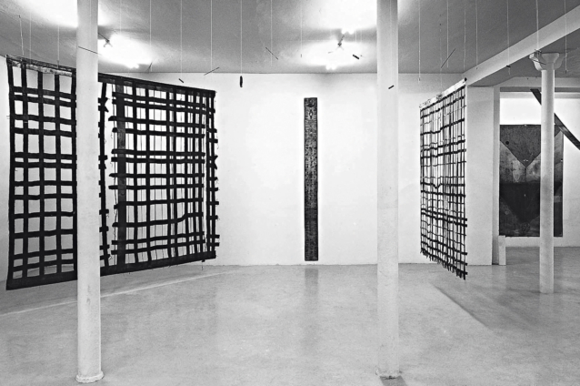
Alan Shields, American, age 31. In France, he was exhibited in 1971 at Galerie Sonnabend and in 1973 at the Biennale de Paris. Given his cultural background and the generation to which he belongs, he should be the focus of particular attention here. After a moment’s shock, or mistrust, at the luxuriance of his paintings (American painting is usually associated with greater regularity and severity in the choice of colors and formal organization), we’ll be interested in his post-formalist situation (i.e., post-Noland, Kelly, etc.) and, as a result, the return to greater freedom of facture and the exploitation of a certain pictorial primitivism. After a belated discovery of American formalist painting in Europe, and having learned from it, criticism of its reductionism and the extreme sophistication to which it had attained began to itch, here and there, in some quarters. In his practice, Shields exemplifies this kind of critique, in much the same way as Robert Morris’s “felt-tips” both continue and challenge Minimal Art, without denying certain formalist achievements: his “grids” accentuate the complexity of the relationship between ground and form, reverse and right, painting and non-painting. In the process, he avoids the pitfall of materialism.Whatever the medium used – canvas, wood, ribbon, strings of pearls in certain old canvases… – Shields organizes them in such a way as to blend them into the whole, producing only the effects of drawing and color. But precisely the richness of these means comes from the fact that Shields, breaking with the history of Western painting alone, from which deduction after deduction formalist painting was extracting itself, was going to draw, like other great Americans before him, on non-Western cultures and also, given the particular situation of the United States today, on marginal cultures (“counter-culture” – “underground”) or minority cultures (Indian). In a way, this is what some Support-Surface artists are looking for here, as they go through a highly artisanal phase, but without perhaps the possibility of articulating it in this way to other cultural realities, and to the infinite possibilities they could offer. In fact, Shields’ painting is neither an appropriation nor a return to practices located outside official culture, but their intrusion into that culture and what they can disrupt within it. Notably for Shields, in an abstract tradition, the resurgence of a “sense” in painting made of associative sequences, humor…
Daniel Abadie, art press, September 1975
Frank Stella
Brazilian series
October 21 – November 15, 1975
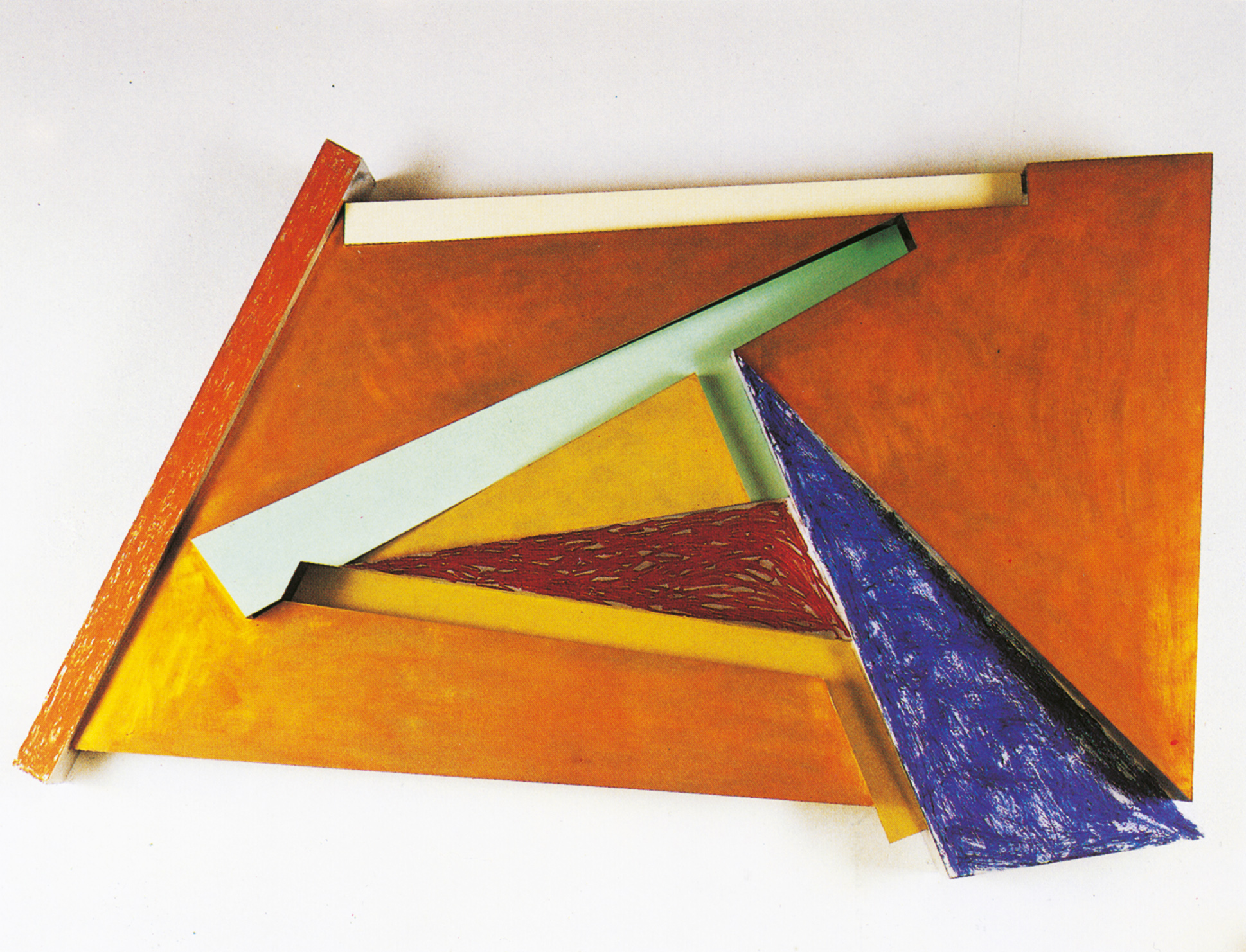
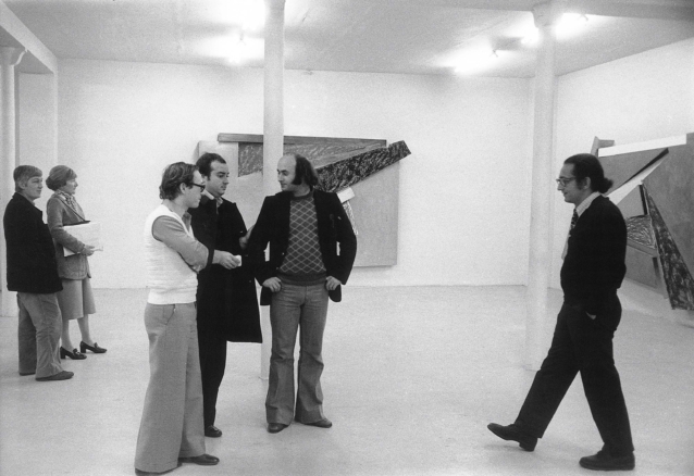
Stella abandons the pattern, but invents new processes that multiply these networks of contradictions. […] If formal complexity no longer revolves around the geometric figure/decorative motif relationship, it is established here in the articulation of more numerous, infinitely larger and codified spaces. First of all, shapes – rectangles, triangles, long strips – made from a piece of metal cut and treated in the tradition of formalist abstraction, in their plain, opaque color. In contrast, some of these plates are covered with a type of regular daub, sometimes completely masking the metal, sometimes allowing it to shimmer. The application is all over. […] Then these planes are assembled, shifted a few centimetres, advancing and retreating in relation to one another. Yet Stella declares that he is not interested in the third dimension per se, that he is in no way concerned with the problems of a sculptor. He is concerned only with the pictorial problem, and what these bas-reliefs achieve is no more and no less than the literalization of depth effects produced in other (flat) paintings.It was at this point that Stella was able to produce two versions of the same formal proposition, one flat, the other in relief. The third dimension – the real one – only comes into play to question the painting’s depth and illusionism. Finally, and perhaps most shockingly to the eye accustomed to modern painting, is the abandonment of the deductive structure (at a time when much of the young, fashionable painting is in the process of academicizing the logic of the square within the square). The formal theme of the series: the rectangle. It breaks down into its diagonals, signified by the stripes, and into triangles cut by these diagonals. As these “pieces” move, the rectangle bursts open, the diagonal merges with a side, the triangles unfold and spread out around an axis like the leaves of a fan. An axis, around which the shapes are organized, and their power relationships. […] This revolutionary space was often used by the Italian Primitives to express movement by distributing space around a center, which they echoed and emphasized. […]
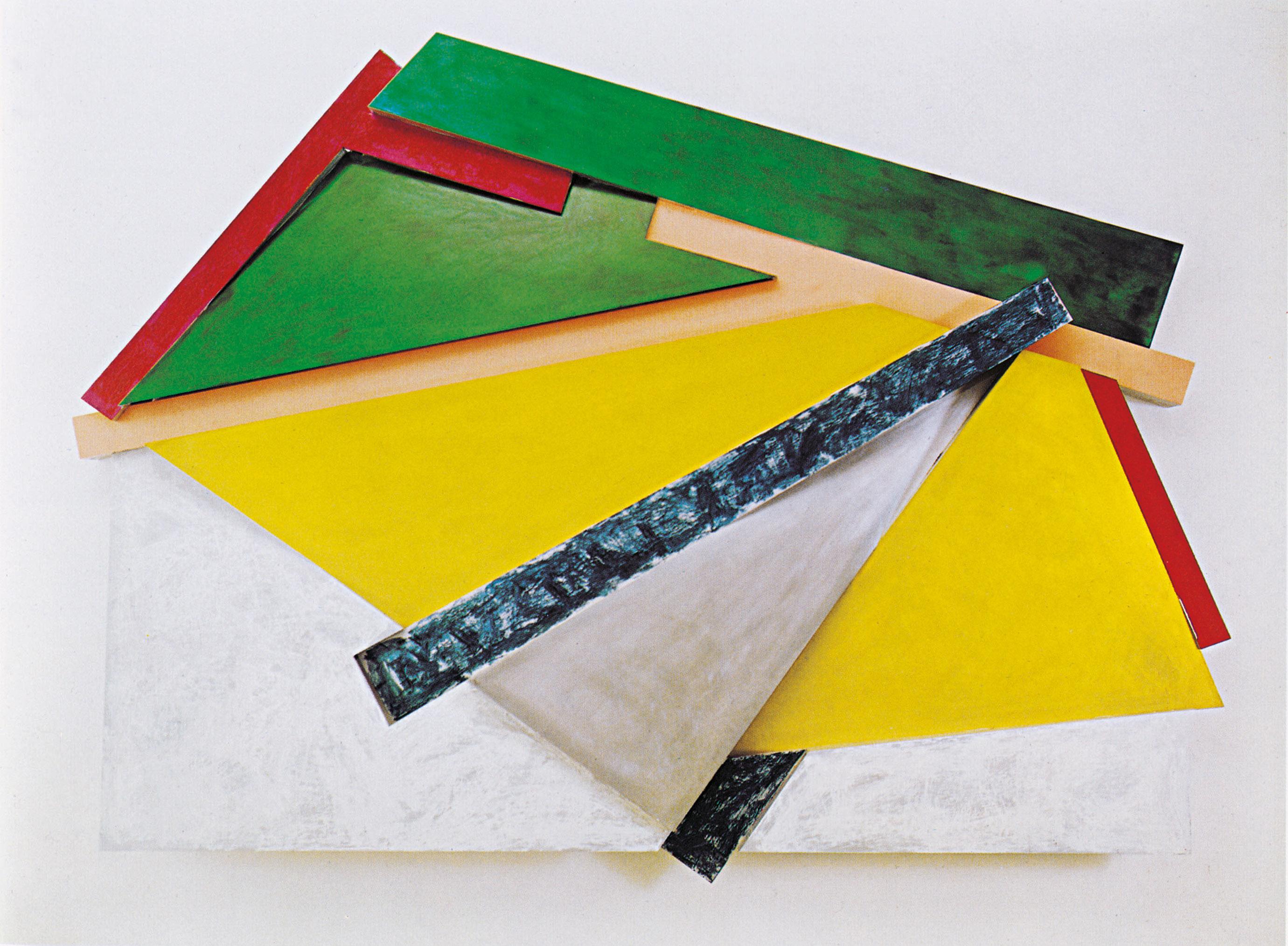
In fact, this space, which suggests movement without depth, would force the painter to tightly interweave all the elements of the painting, homogenizing them. […] The process could only find echoes in our modernity, which avoids particularizing spaces distinct from the overall space, instituting a drawing that invests the entire space of the painting equally. This is what rotating space makes possible, by avoiding over-systematization and formal impoverishment. At the same time, Stella avoids the danger of the inexhaustible broadening of the logic of certain earlier series: complacency.
Catherine Millet, art press, November 1975, extracts
